Custom chatbot development can be expensive, and for product builders and non-technical founders who know exactly what their chatbot should do, that often kills the project before it starts.
Here's what this guide gives you instead: a clear understanding of what makes a chatbot UI work, the design principles that separate interfaces people trust from ones they abandon, and a path to ship a working conversational interface in an afternoon rather than a quarter. You'll walk away with enough design fluency to make smart decisions and enough practical direction to build something real.
What Makes a Chatbot UI Different from Other Interfaces
A chatbot UI succeeds when you design for conversation, not for pages.
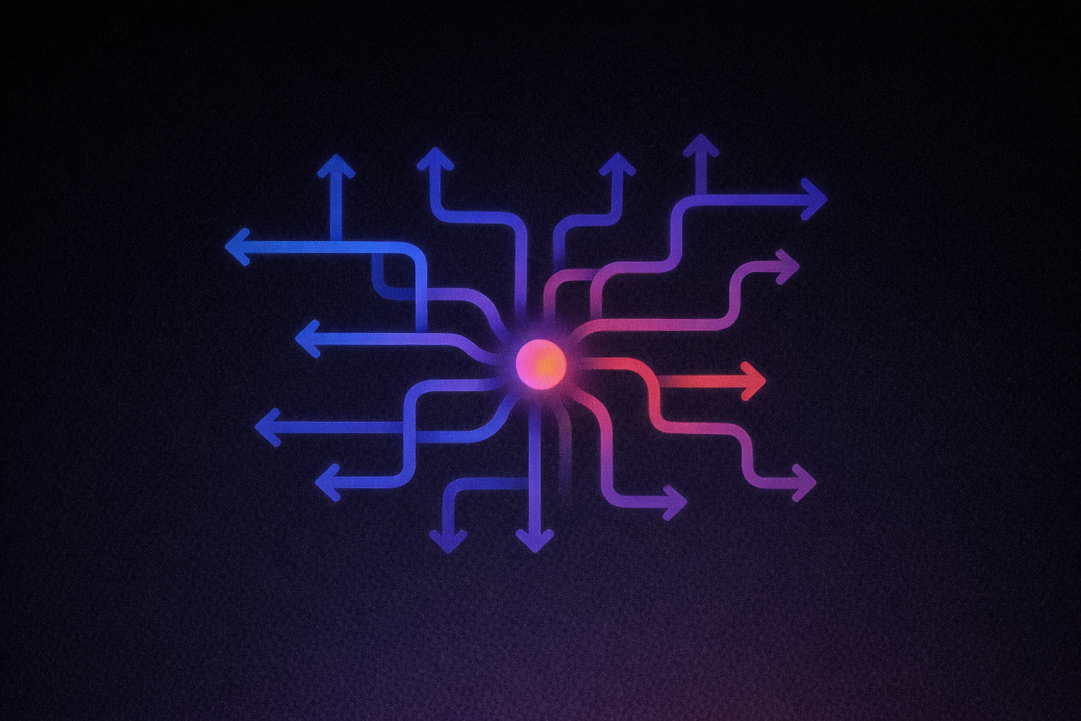
A chatbot UI follows conversation rules, not page-layout rules, and that distinction changes almost every design decision you'll make. The sequential channel cannot efficiently handle breadth, so scope must stay narrow by design, and errors cost an entire additional turn.
Sequential Disclosure Replaces Spatial Layout
On a traditional web page, users scan, compare, skip ahead, and control their own path through information arranged in space. A chatbot eliminates that spatial canvas entirely. Nielsen Norman Group states from usability research that chatbots can display "only a very small amount of information at a time." Every piece of information arrives sequentially, one turn at a time, in an order the user cannot preview or rearrange. This means the sequence in which your bot presents information becomes a primary architectural decision.
Turn-Taking Creates Social Obligation
Traditional interfaces follow the command-based pattern described in AI interaction research: the user acts, the system responds, and the interface can wait indefinitely with no social pressure. Conversational UI replaces this with turn-taking borrowed from human conversation. Each bot message implies an obligation for the user to respond. A confirmation screen works fine on a web page; in a conversation, a message without a clear next turn leaves users stranded.
Wait Time Feels Like Social Silence
This is the subtlety that catches most first-time chatbot builders off guard. On a website, a loading spinner means "the system is fetching data." In a conversation, a pause after someone asks a question feels like confusion, hesitation, or disengagement. Users apply human conversational norms to chatbot interactions, which means typing indicators and streaming text are functional social signals that maintain the conversational contract during processing. Their absence reads as a social breach. You can get these details right from the start with Lovable, the AI-powered no-code builder: you describe your chatbot interface in plain language and build from there. Agent Mode provides autonomous AI development with independent codebase exploration, proactive debugging, real-time web search, and automated problem-solving. You can use it to specify interaction patterns like typing indicators and streaming behavior as part of your initial build.
The Core Components Every Chatbot Interface Needs
A usable chatbot interface depends on a small set of components that each communicate a clear next step.
Each component in a chatbot interface communicates something specific to the user, and understanding that communication function matters more than getting the pixels right.
Message Bubbles and Sender Differentiation
Message bubbles are the foundational display unit: contained visual containers for individual messages in a scrollable thread. Their primary job is communicating whose turn it is in the conversation, typically through positional convention (left for bot, right for user) and color.
NNGroup usability research documented users noting that different colors for their own replies versus the agent's made it "really easy to see" whose message was whose. Consider a three-tier visual approach: user messages, bot messages, and system-generated messages like status updates or confirmations, each with distinct visual treatment. One practical note: bubbles occupy side margins, so long text creates cramped, unpleasant blocks. Break long bot responses into multiple shorter sequential bubbles rather than forcing everything into one.
The Input Field and Send Trigger
The input field communicates what mode of input is expected and how much flexibility the user has. NNGroup documents two distinct failure modes here: removing free text makes users feel constrained, while removing quick-reply buttons forces unnecessary typing. Both input mechanisms need to coexist. The send conventions (typically Enter to send, Shift+Enter for new line) should follow established conventions.
Typing Indicators and Timestamps
A typing indicator in human-to-human chat primarily signals that another user is actively composing a message; in AI chatbot contexts, it can also indicate that the system is processing a response after receiving the user's input. NNGroup discusses progress indicators as a way to inform users that the system is working and to manage wait times. Without one, users cannot distinguish between "processing" and "abandoned."
Timestamps show when each message was sent and give users a reference frame for reviewing the conversation later. NNGroup found that response time shapes users' sense of control and patience: fast responses feel instantaneous or keep users focused, while slow responses make users impatient and more likely to leave.
Error States
Every error state must answer three questions: what happened, why it happened, and what the user can do next. Comprehension errors ("I didn't understand that") and technical failures ("Something went wrong") are distinct cases requiring different messaging. The critical rule: every error state must include a path forward, and the message should never make users feel they did something wrong.
Design Decisions That Affect Trust and Completion Rates
Trust comes from a series of small interface decisions that align expectations with what the bot can actually do.
The components above get your chatbot functional. The decisions in this section determine whether users actually trust it and follow through.
Avatar Presence: What It Signals (and Risks)
An ACM peer-reviewed paper examines how visual humanlikeness and conversational performance relate to trust, finding that conversational performance has a stronger effect while the role of humanlikeness is limited or context-dependent. A human-looking avatar that produces poor responses likely damages trust more than a clearly robotic avatar that performs reliably, because the gap between expectation and reality is larger. Research has explored how chatbot representations affect user experience, but ACM FAccT 2024 identifies a real risk: anthropomorphized chatbot design can foster parasocial trust, where users project agentic roles onto the chatbot and may infer capabilities beyond the system's actual limits.
The practical takeaway: match your avatar's implied capability level to what your bot can actually deliver. A friendly icon or abstract brand mark often outperforms a human photo when the bot's conversational range is limited.
Tone and Transparency Cues
ACM CUI 2025 research on healthcare chatbots found that users consistently prioritized rational, logical design elements (tooltips, displayed credentials, process explanations) over personality-driven or emotionally expressive design. Research suggests warmth and competence are important factors in trust. If your chatbot handles anything consequential, lead with transparency signals.
Quick Reply Buttons: When They Help, When They Constrain
A PMC cessation study found that forced-choice buttons reduced cognitive burden but became boring over time, while users preferred free text for precise expression. The design resolution: quick replies work best for guiding users through structured flows (intake forms, qualification questions), while free text should remain available for moments that require nuance.
Loading and Streaming Behavior
A peer-reviewed study measured the direct impact: instant responses averaged a satisfaction score of 5.67, while long responses without an indicator dropped to 4.40 (F(2,206) = 10.95, p < 0.001). When a typing indicator was present, the negative effect of long latency was significantly mitigated (F(2,206) = 4.02, p < 0.05). Streaming text, where tokens appear progressively rather than all at once, converts a "waiting" experience into a "reading" experience. OpenAI's latency guide classifies streaming as the single most effective approach to perceived latency.
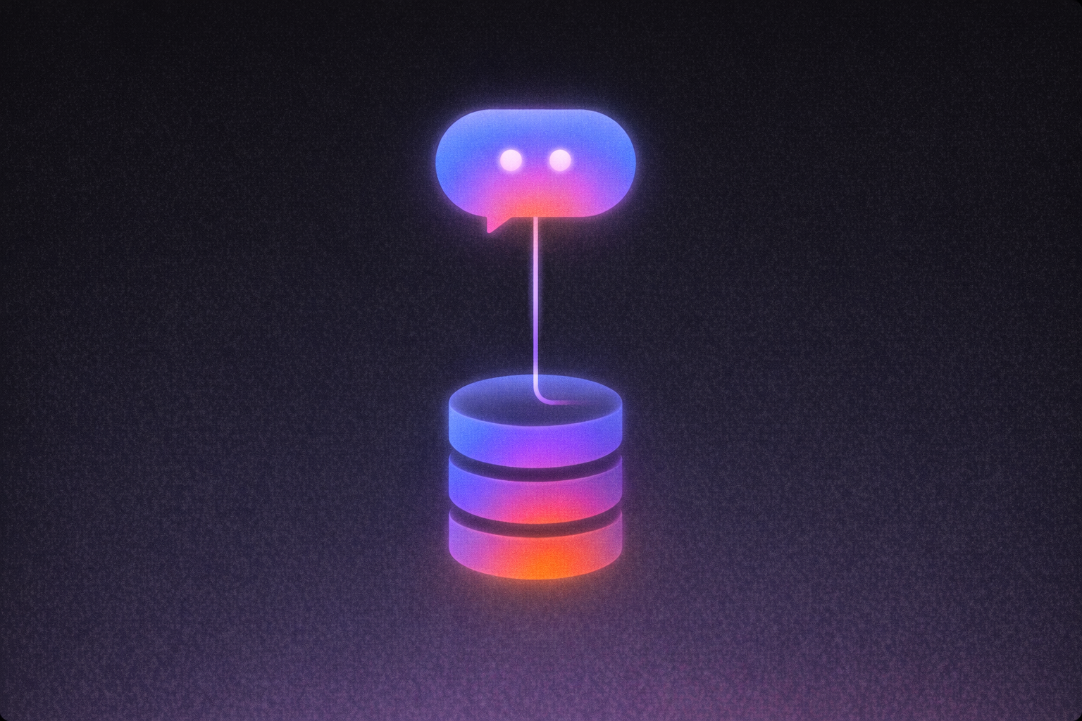
Connecting Your Chatbot Interface to an AI Backend
AI chat interfaces need explicit states for generation, delay, uncertainty, and interruption.
AI-powered chatbots require UI patterns that rule-based bots never needed, because AI fails differently and responds differently.
Streaming Changes Everything
With a rule-based bot, responses return almost instantly because they're pre-written. AI backends generate responses token by token, and that generation takes time. Streaming displays tokens as they arrive instead of waiting for the complete response. Google's documentation illustrates the difference clearly: non-streaming means a long wait followed by sudden text appearance, while streaming means text appears progressively within milliseconds. And add a stop button: because streaming responses have non-trivial duration, users need the ability to cancel mid-stream.
Handling Latency with Named States
When your AI calls external tools (searching documents, running code, querying a database), no tokens flow but work is happening. Show named states like "Searching your documents..." or "Running code..." rather than a generic spinner. OpenAI's latency guide recommends showing as much real progress as possible, and hard-coding deterministic responses (confirmations, refusals, standard prompts) rather than routing them through the language model.
Fallback States and Communicating Uncertainty
Rule-based bots fail in predictable ways. AI backends fail unpredictably: hallucinations, refusals, timeouts, context window overflow. Your UI needs layered degradation. Map API failures to human language ("I'm having trouble connecting right now"). When streaming is interrupted mid-response, display what was generated with a clear "incomplete" indicator and a retry option. Where human support exists, make that escalation path a prominent, always-accessible UI element.
NNGroup hallucination research says uncertainty can be expressed in the first person, such as "I'm not completely sure, but...," and cites research finding that first-person uncertainty outperforms vague hedging. When sources can be cited, show them. Thumbs up/down feedback buttons give users a way to calibrate trust actively. NNGroup has documented users interacting with buttons and prompt controls in AI chat interfaces.
Building and Iterating Without Starting From Scratch
You can go from a design idea to a working chatbot UI much faster when the build and edit loop is short.
You now understand the design principles. The question is how to get from that understanding to a working chatbot interface without months of custom development.
From Description to Working Interface
With Lovable, the AI-powered no-code builder, you describe what you want in plain language and start building right away. Agent Mode provides autonomous AI development with independent codebase exploration, proactive debugging, real-time web search, and automated problem-solving. This is vibe coding in practice: you focus on what the chatbot should do, not how the code should work.
Here's a concrete prompt a builder might use to generate a chatbot interface:
"Build a customer support chatbot with a full-height chat window. User messages right-aligned in blue bubbles, bot messages left-aligned in light gray. Include a typing indicator animation while waiting for responses. Add a text input with a send button and three quick-reply buttons above the input: 'Track my order,' 'Return policy,' and 'Talk to a human.' Use a clean, light theme with #2563EB for accents."
That prompt maps directly to the design principles covered in this guide: sender differentiation, typing indicators, dual input modes (text plus quick replies), and a human escalation path.
Refining Without Re-Prompting
Once Agent Mode generates your chatbot interface, Visual Edits lets you click and modify interface elements in real-time without writing prompts. If you prefer direct code control, every change Agent Mode and Visual Edits make is committed to a GitHub repository you own, so you can extend the codebase, integrate APIs, or customize logic at any point.
For chatbot interfaces specifically, describing what you need in Agent Mode is the recommended starting path, though Lovable's templates offer existing web application foundations to customize. We built Lovable for both paths: you can describe the interface in plain language, or you can take the generated code and keep pushing it further yourself. What takes a development agency months can turn into an afternoon of iterating between description and visual adjustment.
Your Next Step
If you're ready to turn these design principles into something you can actually ship, the fastest move is to start building and refine from there.
If you've worked through these design principles and want a chatbot interface you can actually ship, Start building with Lovable. You can build a customer support intake flow with escalation paths, a lead qualification chatbot with quick-reply branching, or an onboarding assistant that guides new users through setup. That matters when generic templates look like everyone else's and custom development takes too long to justify. With Lovable, you can describe what you want, refine what you see with Visual Edits, and ship a working interface the same day. If you want a head start, Explore Lovable's templates.
Pricing and product feature information in this article reflects what was publicly available as of May 2026. Lovable updates its product regularly. Before making a decision, verify current pricing and features directly on the Lovable website, as well as its official documentation.