Building a responsive website traditionally meant weeks of CSS debugging, testing across dozens of devices, and writing media queries for every screen size. Using pre-built responsive components makes development 47% faster compared to coding from scratch.
Modern AI-assisted platforms now handle this complexity automatically, producing responsive layouts in minutes instead of days while maintaining full code access for customization.
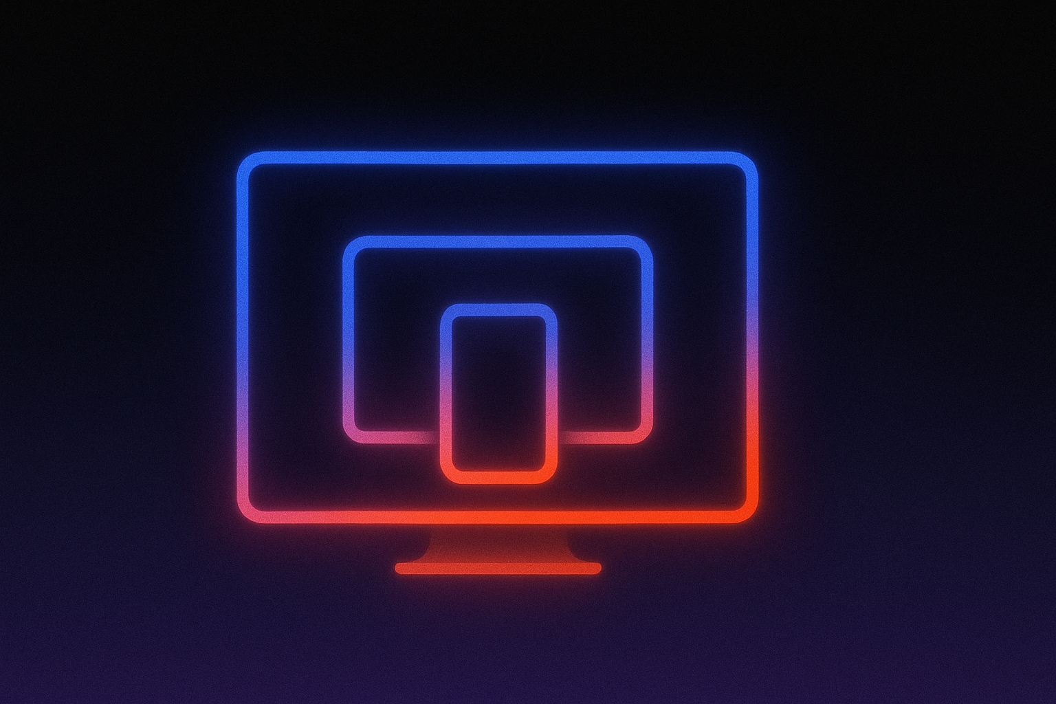
Responsive web design has become essential as mobile devices now account for 52-67% of global traffic depending on measurement source, with Google completing mobile-first indexing on October 31, 2023—meaning your website's mobile version is the primary version used for search rankings.
Modern responsive web design techniques include mobile-first philosophy, fluid layouts powered by CSS clamp() and modern units, container queries (now supported in 93.92% of browsers), and intelligent image handling with srcset and lazy loading that work together to create sites that adapt smoothly across every screen size.
This guide covers the responsive web design techniques that actually matter in 2026 and shows you how to evaluate whether your tools or your development partners are using them.
1. Mobile-First Design Philosophy
Mobile devices now account for over 60% of global web traffic. Statista reports 62.54% of website visits come from mobile as of Q4 2024, while StatCounter measures 52.31% and Similarweb measures 67.5% for November 2025.
The exact percentage varies by measurement methodology, but every major analytics platform confirms mobile has definitively surpassed desktop.
Google made this official when they completed mobile-first indexing on October 31, 2023. Your website's mobile version is now the primary version Google uses for search rankings.
Why Starting Small Creates Better Results
Mobile-first design means beginning with the mobile experience and progressively enhancing for larger screens. The constraint of a small screen forces ruthless prioritization.
Limited mobile space means there's no room for non-essential elements. When you identify what's essential for mobile users, desktop users benefit from the same clarity.
Starting simple and progressively adding complexity proves more sustainable than starting complex and attempting to simplify.
Modern tools like Lovable handle these responsive techniques automatically when you describe what you want to build. You don't need to understand the technical details—just describe your mobile experience first, then add features for larger screens.
The Business Case for Mobile-First
Deloitte Digital research shows 69% of customers are more likely to purchase from brands delivering personalized experiences, which mobile enables through context-aware design.
Organizations achieving high personalization maturity report 71% higher customer loyalty and 67% increased purchase frequency.
When evaluating development platforms or agencies, ask whether they start design conversations with mobile scenarios. This approach leads to cleaner, more focused experiences that convert better across all devices.
2. Fluid Layouts with CSS Grid and Flexbox
Traditional responsive design required developers to manually define breakpoints where layouts change, writing rules like "at 768px width, show 2 columns; at 480px width, show 1 column." Modern CSS Grid and Flexbox techniques eliminate much of this manual work through features like Grid's auto-fit and minmax() functions, combined with Flexbox's flex-wrap property.
These create layouts that automatically adjust based on available space. These responsive web design techniques reduce the need for dozens of manual breakpoint rules.
What This Means for Your Projects
The practical benefit is fewer manual rules to maintain and automatic adaptation to any screen size. A card grid that shows four columns on desktop, two on tablet, and one on mobile can be achieved with a single layout declaration rather than multiple breakpoint rules.
This translates to faster development cycles and more predictable behavior across devices. When a designer hands off a new component, developers spend less time writing conditional logic and more time refining the user experience.
The layout simply responds to available space, eliminating entire categories of bugs that occur when fixed breakpoints don't match real-world device dimensions.
How AI Tools Apply Modern Layout Techniques
You don't need to understand CSS Grid or Flexbox to benefit from these techniques. When you describe a layout to AI-powered platforms, they automatically apply these modern patterns for you.
Lovable generates TypeScript/React full-stack applications that follow modern responsive web design techniques. When you describe a layout like "show a grid of pricing cards that adapts to screen size," the generated code follows modern CSS patterns for responsive layouts.
Agent Mode autonomously builds entire responsive layouts from a single description, while Chat Mode enables iterative refinement. Ask for adjustments like "make the mobile navigation collapsible" and see changes applied immediately.
For developers who want deeper control, Lovable provides full GitHub sync, clean TypeScript/React output, and the ability to eject and continue development independently whenever needed.
3. Container Queries for Component-Based Design
Container queries represent the most significant advancement in responsive web design techniques since media queries themselves. With 93.92% global browser support as of December 2025, this technology is production-ready.
Traditional media queries respond to the viewport—the entire browser window. Container queries respond to the size of the component's parent container, enabling truly reusable components.
Why Container Context Matters
Consider a product card component. With traditional media queries, the card's layout depends on screen width.
Place that same card in a narrow sidebar versus a wide main content area, and it displays identically despite having vastly different available space.
Container queries solve this. The card adapts based on its container's size, not the overall screen width.
A card in a sidebar displays its content vertically while the same card in a wider section shows a horizontal layout—all without requiring different breakpoints for each scenario.
This fundamentally changes how teams build component libraries and design systems. Components become truly portable, working correctly wherever they're placed without additional configuration or context-specific overrides.
Design systems can ship fewer component variants because each component intelligently adapts to its surroundings.
Browser support spans Chrome 106+, Safari 16.0+, Firefox 110+, and Edge 106+.
When you describe component layouts to AI-powered tools, they handle container queries automatically. Your components will adapt to their containers without you needing to specify the technical rules.
4. Responsive Images and Performance
Images often comprise the largest portion of page weight, making them critical for both user experience and search rankings. Google's Renault case study documents the business impact: bringing LCP to around 1 second led to a 13% increase in conversion rate, while achieving LCP under 1.6 seconds correlated with a 14 percentage point decrease in bounce rate.
Modern Image Techniques
Responsive image attributes (srcset and <picture>) allow browsers to automatically select appropriately-sized images based on the user's device. This prevents mobile users from downloading unnecessarily large files.
Modern image formats (WebP, AVIF) provide dramatic file size reductions—up to 95% compared to legacy formats. Sentry's engineering team documented 22% faster UI performance after setting up these techniques.
Strategic lazy loading defers loading images until users scroll near them. Lazy loading should only apply to images below the initial viewport—never to the main content image users see first.
Modern development platforms handle these image enhancements automatically. When you add images to your project, they are converted to efficient formats and sized appropriately without manual intervention.
Layout Stability
Images without specified dimensions cause content to "jump" as they load. Always specify width and height attributes to prevent this layout shift, as recommended in Google's Core Web Vitals guidance.
5. Fluid Typography and Spacing
Traditional typography requires defining text sizes at multiple breakpoints, creating jarring jumps when text suddenly changes size. Fluid typography scales smoothly using the CSS clamp() function, which combines relative units (rem) for boundaries with viewport units (vw) for scaling.
The clamp() function defines three parameters: a minimum value, a preferred value that scales with screen width, and a maximum value. Body text typically scales from 1rem to 1.125rem, with headings using larger scaling ranges for clear visual hierarchy.
AI-powered platforms handle fluid typography automatically. When you describe your design preferences, they apply smooth scaling across screen sizes without you needing to understand the technical details.
Accessibility Requirements
A crucial accessibility concern: viewport units don't scale when users zoom their browser. The solution uses rem units for minimum and maximum values, which scale with browser zoom.
This ensures text scales appropriately with user preferences and assistive technologies.
6. Testing Responsive Web Design Techniques
Effective responsive testing requires three complementary approaches: browser DevTools for rapid iteration, between-breakpoint validation to catch layout issues, and strategic real device testing for production verification. These methods ensure your responsive design works across real-world conditions.
Browser DevTools
All major browsers provide free testing tools. Chrome's DevTools offers device presets, custom dimensions, draggable handles for fluid width testing, touch event simulation, and network throttling. Firefox, Safari, and Edge provide similar capabilities.
Start by testing at your defined breakpoints, then use the responsive viewport toggle to catch issues between those breakpoints. The ability to simulate slow network connections helps identify images that may load too slowly on mobile devices.
Between-Breakpoint Testing
Research shows most testing focuses on defined breakpoints, while real users access websites at countless viewport dimensions: resized browser windows, split-screen modes, and non-standard resolutions.
The recommended method: start at your smallest breakpoint, then slowly drag the browser window wider while observing the layout.
Watch for content overflow where text or images extend beyond their containers. Notice awkward text wrapping where headlines break at unintended points. Check for navigation collisions where menu items overlap at specific widths. Pay attention to touch targets that become too small or spacing that compresses uncomfortably. This catches issues before users encounter them.
Visual Edits in Lovable enables real-time UI adjustments during this testing process. Click and modify interface elements directly when you spot issues.
Real Device Testing
Real devices provide actual graphics performance, hardware behaviors, and network variability that emulators approximate. Prioritize devices based on your actual user analytics.
Responsively App provides free, open-source multi-device visualization with synchronized scrolling across multiple screen sizes.
Start Building
The responsive web design techniques that matter in 2026 share a common thread: they work automatically rather than requiring manual rules for every scenario. Mobile-first forces prioritization. CSS Grid and Flexbox create flexible layouts. Container queries enable reusable components. Modern image handling improves Core Web Vitals. Fluid typography scales smoothly while maintaining accessibility.
AppDirect's non-technical marketing team has vibe-coded over 200,000 lines of production code using Lovable, while Sentry built a complete ROI calculator in two hours.
Try Lovable and describe the responsive application you want to build.