The shift from 2025 to 2026 marks a pivotal moment in web design. After years of AI experimentation and template fatigue, designers are moving toward intentional, human-centered approaches that prioritize authenticity over algorithmic sameness. These trends represent solutions to real problems: designers and brands figuring out how to stand out when the baseline is higher, how to earn attention when it's scarcer, and how to signal craft and intention in their work.
Not every trend belongs on every site. The following website design trends represent genuine opportunities for non-technical builders, with practical guidance on when each makes sense.
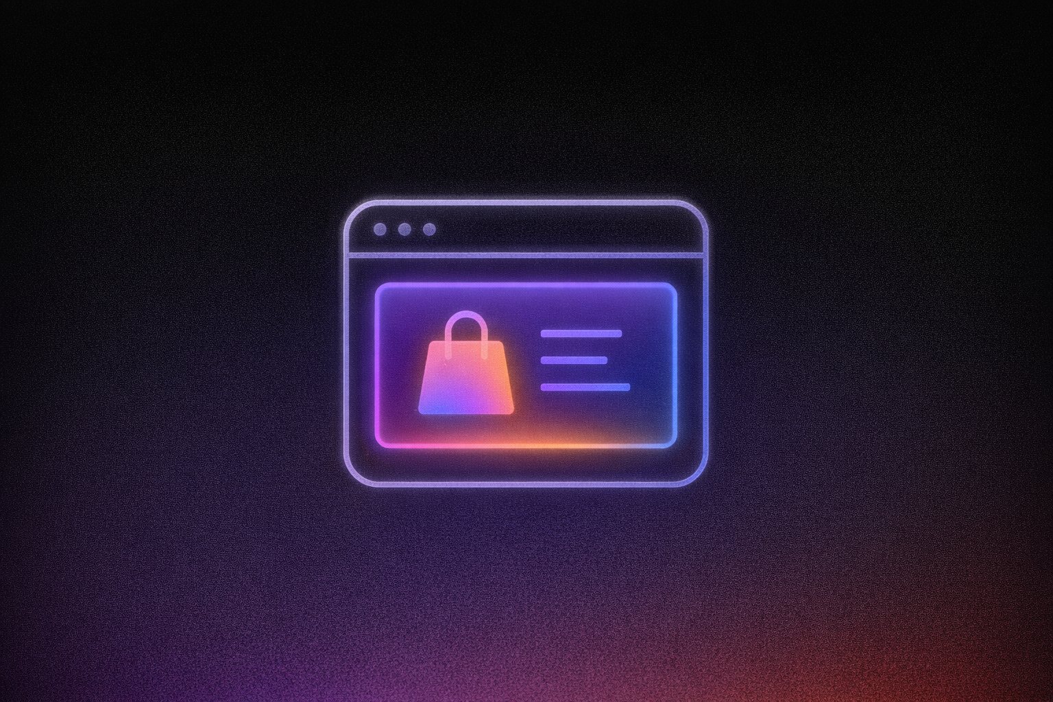
1. AI-Powered Personalization: Websites That Adapt to Each Visitor
Websites in 2026 evolve beyond static pages toward dynamic, personalized experiences. This is a new interaction model in which AI creates a fully dynamic interface based on any user request, rather than simply generating text or content.
How It Works
AI analyzes visitor patterns (what they click, how long they stay, where they came from) and adjusts the interface in real time. A returning customer might see different hero content than a first-time visitor. Product recommendations surface based on browsing history rather than generic bestseller lists.
Key Considerations
Personalization works best when you have enough traffic to generate meaningful patterns. Sites with limited traffic should start with simple segmentation, such as different messaging for different traffic sources, before building toward fully dynamic layouts.
Platforms like Lovable make this approachable through Agent Mode, which provides autonomous AI development with independent codebase exploration, proactive debugging, real-time web search, and automated problem-solving to build adaptive interfaces without requiring you to code the logic yourself.
2. Kinetic Typography: Animated Text That Commands Attention
Typography now moves, transforms, and responds to users. Variable fonts, animated text, and responsive kinetic type anchor hero sections and product pages across leading websites.
How It Works
Text becomes a visual focal point rather than a supporting element. Letters scale, rotate, or transform as users scroll through scroll-triggered animations. Headlines respond to cursor movement. Words reveal themselves through choreographed animations that guide attention exactly where you want it.
Key Considerations
Kinetic typography works powerfully in hero sections and key messaging areas. Avoid applying it to body copy or navigation. Readability matters more than visual interest for content people need to actually read. Test animations on mobile devices, and design with the ability for users to pause or disable motion for accessibility.
Modern visual builders offer animation tools that make kinetic typography accessible without coding. Lovable's Visual Edits feature lets you click and modify interface elements without writing prompts, allowing you to adjust text, sizes, and styling directly in the interface.
3. Micro-Interactions and Motion Design: Subtle Feedback That Guides Users
Small, thoughtful animations provide feedback and guide users through their experience. A button that subtly shifts when hovered confirms interaction is possible. A checkmark that animates when a form submits provides confirmation. Loading indicators that feel responsive maintain engagement during transitions.
How It Works
Micro-interactions are single-purpose design elements that provide immediate feedback for user actions. They make interfaces feel alive without overwhelming the experience. These elements convey system status, support error prevention, and communicate brand.
Key Considerations
Focus micro-interactions on functional moments like form submissions, button clicks, navigation transitions, and loading states. Each animation should serve a purpose by confirming an action, guiding attention, or communicating progress.
Avoid adding motion purely for decoration, as excessive animations create cognitive overload and slow perceived performance. Test interactions across devices, since effects that feel smooth on desktop may stutter on mobile.
4. Dark Mode and Dynamic Theming: Interfaces That Respect User Preferences
Interfaces now adapt to system settings and user preferences, offering dark themes when enabled at the operating system level. Dark mode can extend battery life on OLED displays, though visual performance benefits depend on individual user characteristics.
How It Works
Websites detect operating system preferences and automatically adjust color schemes. The best setups offer manual overrides for users who want light mode regardless of system settings.
Dark mode is popular but not essential. Most users enable it at the OS level and don't expect every site to provide custom dark themes.
Key Considerations
Both light and dark modes must independently meet WCAG accessibility standards with minimum contrast ratios of 4.5:1 for regular text. Accessibility experts clarify that offering dark mode alone doesn't satisfy contrast requirements. Use dark grey rather than pure black as the primary surface color.
5. Organic Shapes and Anti-Grid Layouts: Breaking Template Uniformity
Fluid compositions replace rigid rectangular grids. Soft curves, asymmetrical arrangements, and flowing shapes create visual distinction while maintaining usability.
How It Works
Designers increasingly use organic layouts with curves, asymmetry, and flowing shapes to soften rigid grids and make interfaces feel more natural and less mechanical.
Key Considerations
Organic layouts require more planning than grid-based designs to ensure content remains readable. Start subtle with curved section dividers and soft shadows before attempting fully asymmetrical compositions. Experiment with SVG-powered masks and shape dividers using visual builders.
6. Anti-Design and Neo-Brutalism: Raw Aesthetics for Bold Statements
Some brands deliberately reject polish in favor of raw, unfinished aesthetics that communicate authenticity and rebellion against corporate sameness. These website design trends work powerfully for the right brands, though they require careful consideration of audience expectations.
How It Works
Bold color palettes with high contrast. Sharp geometric forms. Utilitarian layouts that prioritize function over decoration. Neubrutalist websites apply brutalist architecture principles (a rough, unadorned surface) to digital design. Awwwards showcases examples, including Toggl's brutalist design with mini games.
Key Considerations
This approach works for creative agencies, fashion brands, and tech companies seeking differentiation. It fails for financial services, healthcare, and enterprise B2B contexts where conventional polish signals trustworthiness.
7. Accessibility-First Design: Building Inclusion Into Core Decisions
In 2026, UX design agencies are embedding accessibility into the foundation of digital experiences rather than treating it as a retroactive addition.
How It Works
Clear contrast ratios, screen reader support, keyboard navigation, and appropriately sized tappable areas become default requirements. This includes descriptive alt text for all images and properly labeled form fields. Color contrast tools built into platforms and browser developer tools help verify text remains readable against backgrounds.
The Accessibility Opportunity
The 2025 WebAIM Million report found that 94.8% of the top one million home pages contain at least one detectable WCAG 2 A/AA failure, and that low‑contrast text appears on 79.1% of home pages, making it the most common accessibility issue.
Key Considerations
Start by testing keyboard-only navigation and verifying color contrast meets standards. Many modern platforms include accessibility features; Lovable's AI can generate accessible markup when prompted through Chat Mode, which provides an interactive collaborative interface for planning, debugging, and iterative development.
Prioritize high-impact fixes first: color contrast, image alt text, and form labels address the most common failures. Remember that accessibility benefits everyone. Clear contrast helps users in bright sunlight, keyboard navigation helps power users, and descriptive labels help everyone understand forms.
8. 3D Elements and Immersive Visuals: Adding Depth Without Sacrificing Load Times
Three-dimensional content becomes more practical for non-technical builders through modern platforms that handle technical complexity.
How It Works
Interactive 3D models and scroll-triggered depth effects add visual interest without requiring visitors to download large files.
Key Considerations
Performance remains a core 2026 principle: 3D elements must work with speed rather than against it. Use lazy loading to defer 3D content until needed and compress models before adding them. Consider whether full 3D serves your goals or whether lighter alternatives achieve a similar impact with better performance. Reserve interactive 3D for product showcases, portfolio pieces, or hero moments where the visual payoff justifies the loading cost.
9. Variable Fonts and Bold Typography: Text That Adapts and Commands
Single font files now contain entire ranges of weights and widths, replacing the need to load multiple separate files while enabling more expressive typography.
How It Works
Variable fonts use axes that control attributes like weight and width. Instead of choosing from preset options, designers access continuous ranges, all from a single file. Google Fonts provides a dedicated filter for variable fonts with guidance on web use.
Key Considerations
Variable fonts support the 2026 shift toward typography with real personality while improving load times.
10. Performance-Driven Design: Speed as Foundation
Mobile devices now account for 57-59% of global e-commerce transactions, making performance the essential prerequisite that enables every other design trend to succeed.
How It Works
Mobile-first design, image optimization, and lazy loading become baseline expectations. DesignRush reports that 91% of online consumers want better digital experiences.
Research from Deloitte in collaboration with Google found that decreasing mobile load times by just 0.1 seconds resulted in an 8.4% increase in conversion rates for retail sites. The same research found that 53% of mobile users abandon pages that take longer than three seconds to load.
Key Considerations
Target under 2.5 seconds for Largest Contentful Paint (LCP). Choose platforms with strong Core Web Vitals performance. Top-performing CMS platforms achieve 84.87% of sites passing Core Web Vitals standards.
How to Choose: Matching Trends to Your Goals
Your audience's expectations: A creative agency can embrace neo-brutalism; a financial services firm needs conventional polish that signals trust.
Your resources: Some trends, like variable fonts and dark mode, add value with minimal effort. Others, like custom 3D elements, require more planning.
Your differentiation strategy: Trends that everyone adopts stop differentiating. Look for trends your competitors haven't embraced yet.
Your testing capacity: Before committing fully to any trend, test it on a single page or section. Measure user engagement and performance impact, then scale what works. This reduces risk while letting you experiment with bolder approaches.
When building without coding experience, vibe coding with Lovable lets you describe what you want in plain language and let AI handle the technical details. Visual Edits lets you click directly on interface elements to adjust styling, similar to working in Figma but with production code underneath.
Your Next Move
These website design trends are achievable without hiring developers. Modern no-code platforms have democratized powerful design tools. The designers who will define 2026 are reclaiming intention over trend-chasing.
Start with trends that align with your brand. Test one approach. Measure results. Iterate.
If you have ideas but lack a development team, try Lovable to describe what you want to build and ship professional results without writing code. Whether you're applying bold typography, organic layouts, or accessibility-first design, you can move from concept to live site while your competitors are still waiting on developer estimates.