Marketing Components Library
This page showcases all available marketing components and provides instructions on usage.
Hero
New Feature
Build Amazing Products
Create powerful applications with our intuitive platform that scales with your needs.
Options
- Badge text: Small highlight text that appears above the main title
- Main title: Primary headline text
- Subtitle: Descriptive text below the title
- Primary button: Main call-to-action button (optional)
- Secondary button: Optional second button (optional)
- Scroll target: Makes a scroll-down arrow appear that jumps to a specific section
Section Heading
Powerful Features
Everything you need to build, deploy, and scale your applications with confidence.
Get StartedOptions
- Title: Main heading for a content section
- Subtitle: Optional explanatory text that appears below the title
- CTA Label: Label for the call-to-action button
- CTA URL: URL for the call-to-action button
Feature Grid
Save Data & Files
Store and access all of the information that your app needs.
This means your app can store messages, photos, customer orders, user profiles, handle file uploads and more.
Manage users
Add user signup and login flows, and manage your users all in one place.
If your app requires user accounts or role based permissions, Lovable Cloud has you covered.
Connect safely with other services
Ensures your app can safely talk to other tools and services, without exposing private data.
Enable integrations with LLMs, payment providers, email services and more.
Options
- Features: Array of feature items with title, description, icon, and optional use case
- Icon Name: Icon to display for each feature (from the icon library)
- Icon Class: Optional CSS classes for icon styling (e.g., colors)
- Title: Main heading for each feature
- Description: Brief explanation of the feature
- Use Case Description: Optional detailed use case or examples
Notes
- Grid layout: 3 columns on desktop, 2 on tablet, 1 on mobile
- Last item spans 2 columns on tablet if odd number of items
- Each feature card has an aspect-square ratio on desktop
- Icons can be customized with color classes
- Also available for four items
Used on
Feature Row
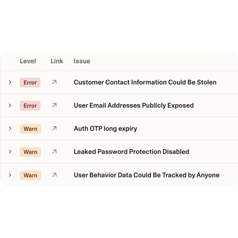
Security Checker 2.0
Your site's new body guard with real-time protection
Automatically scans for exposed secrets with real-time notifications and continuous updates with new scanning modules to keep your projects secure.
Options
- Title: Feature or section name
- Subtitle: Optional short description
- Content: Detailed description/list of list items/anything really
- Image: Image
- Background: Whether the image should have the grained gradient background or not
Notes
- If multiple feature rows follow each other they will flip on every other row
- Image appears on the right for odd rows, left for even rows
- Background defaults to true (with gradient wrapper)
Three Column Stats
- 10M+
- Projects Created
- 99.9%
- Uptime
- 150+
- Countries
Options
- Number: The statistic value
- Label: What the number represents
Notes
- ⚠️ Requires exactly 3 items
Used on
Four Column Stats
- 50K+
- Active Users
- 1M+
- API Calls/Day
- 24/7
- Support
- 99%
- Satisfaction
Options
- Number: The statistic value
- Label: What the number represents
Notes
- ⚠️ Requires exactly 4 items
Used on
Step By Step Process
1
Describe
Share your idea, upload a screenshot, or describe what you need
2
Build
Lovable creates a working prototype in minutes, not months
3
Refine
Iterate quickly with your team using real, interactive prototypes
4
Create
Turn validated concepts into production-ready applications
5
Scale
Deploy and grow with confidence knowing your foundation is solid
Options
- Title: The main heading for each step
- Subtitle: Descriptive text explaining what happens in this step
Used on
Icon List
- Easy to integrate with existing workflows
- Scalable architecture that grows with your business
- 24/7 customer support and monitoring
- Enterprise-grade security and compliance
Options
- List items: List of items that are displayed in a list, haha
Notes
- The checkmark icon is just the default and can be replaced with any icon
Used on

Options
- Title: Main card heading
- Subtitle: Optional descriptive text
- Image: Visual element for the card
- Link text: Text for the link
- Destination URL: Where the card links to when clicked
Notes
- Entire card is clickable
- Arrow icon animates on hover
- Responsive: stacks vertically on mobile, horizontal on desktop
Used on
Logo Cloud
Trusted by the world’s most innovative teams
Trusted by the world’s most innovative teams
Options
- Title: The text displayed above the logo cloud
- Monochrome: The component is available both with original logo colors and in monochrome
- Styling: The monochrome version can be set to any color
Notes
- ⚠️ Requires a minimum of 6 logos
- If more than 6 logos are provided, we randomly replace one logo every 5 seconds
Used on
Testimonial Carousel
"My software development community gets more productive using Lovable…The diversity of bringing non-STEM disciples (into development) will help us solve more meaningful, purposeful problems the world has…We want to be a company which is pioneering that."
Ravi Kumar
CEO, Cognizant
Options
- Items: List of items, each containing one or more of:
- Content: The main text of the card
- Author: The author of the text
- Author Subtitle: The subtitle of the author (most likely title and/or position)
Notes
- ⚠️ Requires 2 or more items